
Sustainable Farming Association
Website Redesign Strategy and Toolkit
Overview
The Sustainable Farming Association advances environmental stewardship, economic resilience, and strong, diverse communities through farmer-to-farmer networking, education, demonstration, and research. The SFA was formed as a response to the 1987 Land Stewardship Project. Farmers wanting to learn how to care for the land and the planet needed a way to share knowledge with one another. And from this, a farmer-to-farmer education network was born.
The Challenge?
The SFA’s website was built 12 years ago in WordPress. It is in need of a total refresh: to update its responsiveness, clean up its navigation and content, and create a better experience for farmers and partner groups wishing to find information. My team and I were tasked with providing SFA with the tools to begin their redesign on the right foot.
Methods
Stakeholder Interview
Comparative Analysis
Kan Ban Board
IA Diagram
Usability Testing
Contextual Inquiry
Card Sorting
Personas
User Journey Maps
Low-Fidelity Wireframes
High-Fidelity Wireframes
Tools
Theydo
Miro
Google Docs
Figma
Figjam
Adobe Illustrator
Keynote
Process
A stakeholder interview was done to better understand the organization, the site, its users, and the goals for the project. Overall, SFA stakeholders want a site that is:
Accessible
Responsive
Visually appealing
Less cluttered
The site should be useful and also provide visitors with a sense of community while being a tool for sharing technical skills and resources.
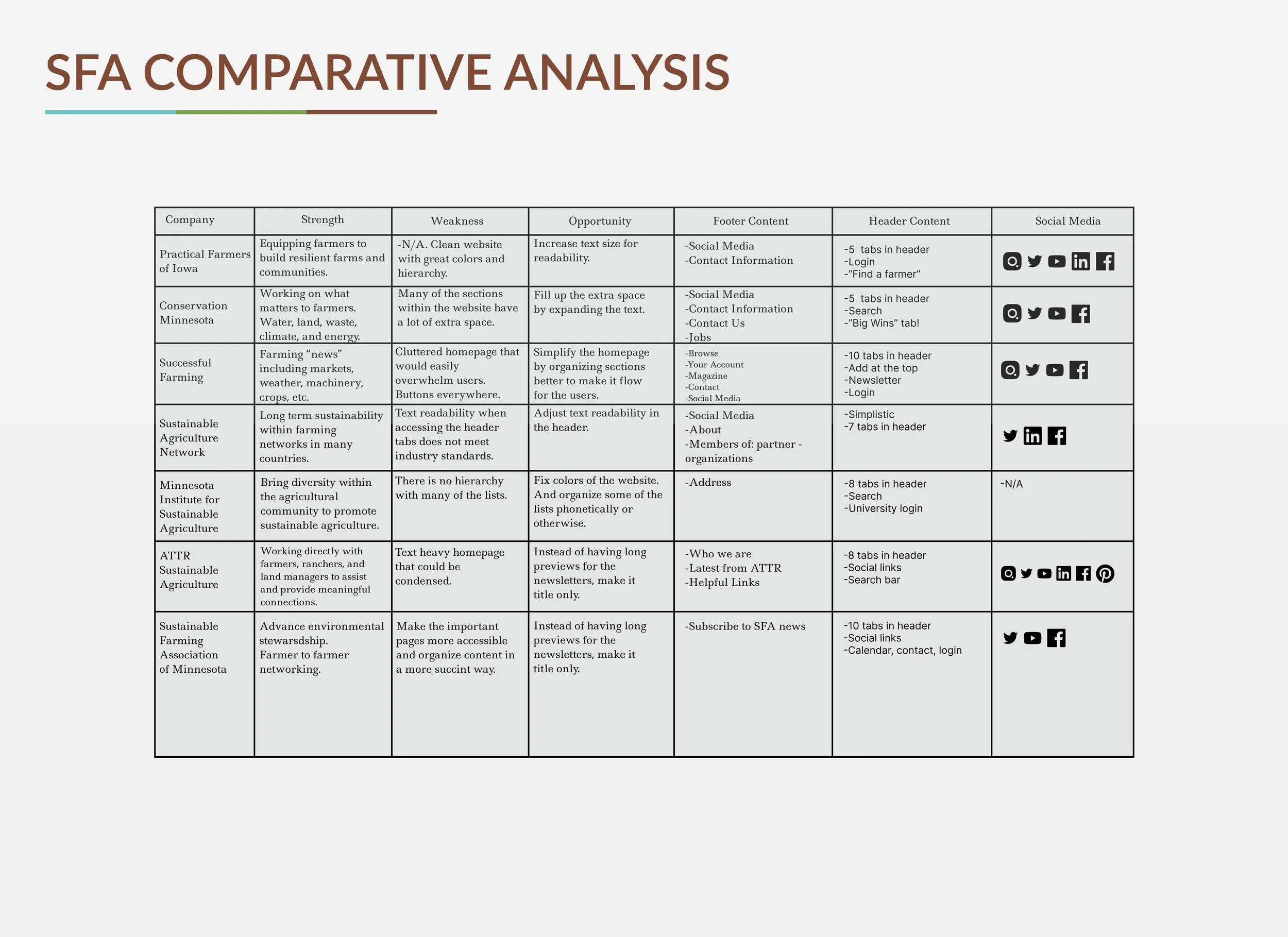
Keeping the goals in mind, a Comparative Analysis was created using several other farming websites.
The Analysis offered insight into how similar sites display their pertinent information. Notably, many of the sites had too much information in the header, yet important pages were not as accessible as they could be.
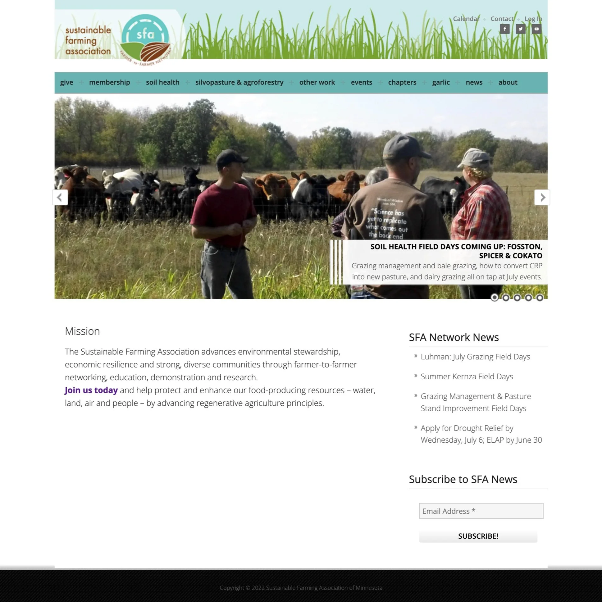
Before the stakeholder interview, the SFA site was given a look-through to better understand the original site view from the eyes of visitors and frequent users.
The site is 12 years old and has had no redesigns in that time. The SFA’s current homepage. The current design is not responsive, and visually lacking, with a cluttered ten-item nav bar, and an under-utilized footer.
Comparative Analysis
Site Map
I created site maps to better represent the current SFA infrastructure. Giving the clients an idea of how immense the content on the site is for visitors of the site.
I then created site maps to represent the site’s infrastructure if the redesign was implemented.

Card Sorting
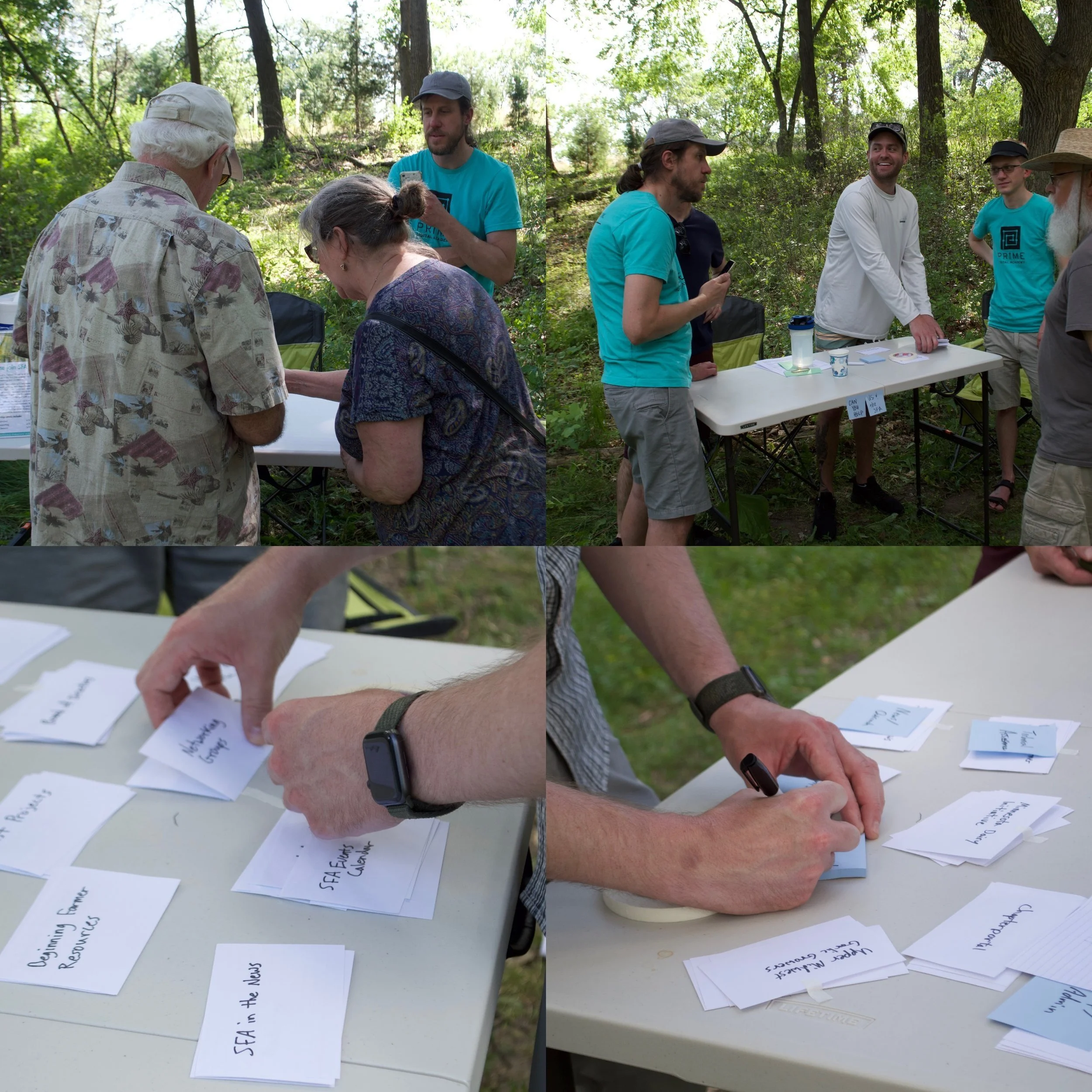
Attending an in-person event hosted by SFA, Returning Livestock to the Land, was a great experience in being able to speak face-to-face with visitors of the site to gain a better understanding of how they feel using the site in its current state.
Setting up a table at the event’s entrance allowed for a variety of people to participate in a card sorting exercise to see how they would categorize the site for more ease.
The data from the Card Sort was then synthesized and organized into main categories for the redesigned header.
They were organized as:
Events, Resources, Media, About, and Contact
The secondary categories are:
Calendar, Search, Chapters, Donate, Join, Languange, and Login.
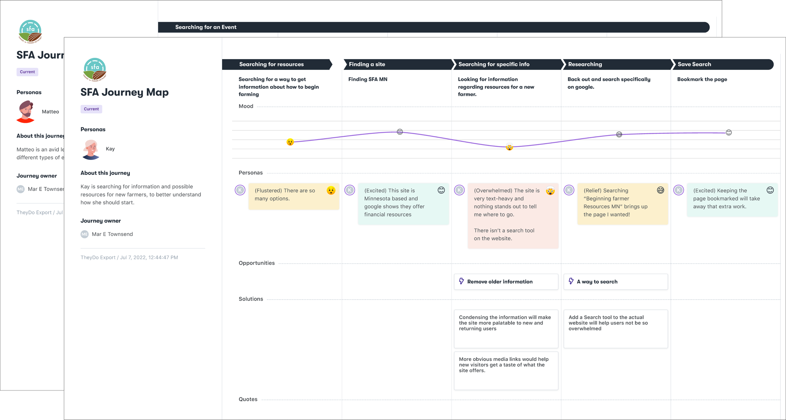
User Personas and Journey Maps
Using information obtained from User interviews and Usability Testing, I created two personas, Kay and Matteo.
Matteo is an avid learner who loves the community feel of going to different events. He wants to check out upcoming events, gain insight into the upcoming events and add those events to his calendar. He found himself frustrated by the lack of upcoming information on the homepage, the inability to find events nearby, and the lack of event descriptions.
Kay is searching for information and possible resources for new farmers. She wants to find accessible resources, learn more about getting started, and find a community to learn from. She found herself frustrated while navigating the current SFA site due to how vast the site is, there was no way to search for information and the lack of clear directions to help new users navigate the site with ease.
Journey Maps
To better illustrate the experience of the two users, Matteo and Kay, I created journey maps.
Click the button below to view the Persona cards and Journey Maps.
Site Redesigns
With the data from the card sort, we organized user-created headings into five main categories, as opposed to the original ten navigation categories, with one to three sub-categories within each main category.
The new Resources tab has three sub-categories: Education, Groups, and Programs.
MAP
On the current site, there is an inability for the site users to find things near their area. Usability tests confirmed that users didn’t have a good sense of which SFA chapters were located where. To solve this problem, we created an interactive map with chapter titles shown visually throughout the state.
Accessibility
A major focus of the redesign was to create an accessibility guide for the stakeholders to implement to increase ease of use for any users visiting the site. Through the use of the Web Content Accessibility Guidelines, screen readers, keyboard controls to navigate the site, and a consultation with an accessibility expert, a findings and recommendations report was presented to the stakeholders to show how accessibility can be improved throughout the site.
Wireframes
Using the newly created style guide and accessibility guide, high-fidelity wireframes were created to better demonstrate what the site has the potential to become.
This included a mobile design to ensure that the site can be accessed from anywhere; whether in an office, in front of a computer, or in the fields from your phone.
Conclusion
The SFA has stood as a beacon of community for sustainable farmers throughout the state of Minnesota for decades. It’s time their website reflects that history, wealth of knowledge, and strong community in a way that's clean, modern, and accessible.
New visitors to the site should be able to quickly understand the SFA and its mission and be able to easily find the resources and events they are interested in. Visitors feel empowered to learn more and excited to become a part of the community.
And with the above changes, I believe they can achieve any goals they have.